IAPA Data Storytelling Workshop for 2023
If you want to convince, convey or communicate with business stakeholders using data as evidence, you better have more than a table of numbers ready.
Today, your narrative or how you tell a compelling, persuasive and memorable story based on your data is one of the hottest skills for analytics professionals, data workers and technology experts. It’s part art and part science.
We know that developing your data storytelling and data visualisation skills will enhance your career and dramatically improve interactions with business stakeholders and the c-suite.
Workshop instructor, David McCandless, literally wrote the book (actually books) on data visualisation and telling a data-based story through visual cues that structure a narrative for better decision making. Globally, David McCandless and his “information is beautiful” approach has gained a cult following from data analysts, data scientists – in fact, any kind of data worker wanting to communicate insights for comprehension, clarity and conciseness.
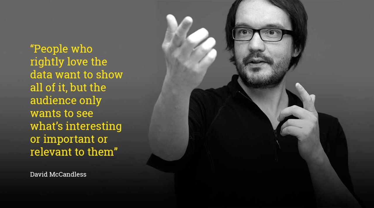
IAPA is pleased to provide those working with data in Australia – from data scientist to analyst, technologist, marketer and financial expert - the opportunity to learn from David McCandless in this four-hour Data Storytelling Workshop.
You’ll explore the thinking behind the best data visualisations, develop your own ideas, interact and exchange ideas with others and maybe even have your data viz ideas critiqued by David.
"People come away from my workshops learning new techniques and approaches for their toolbox and ways of going beyond the bar chart”
David McCandless
Next Workshop
November 2023
Limited numbers | Interactive virtual session
$400pp inc GST
Group pricing:
Buy 10 tickets and get one free
just add 11 tickets into the cart
and the 11th is free!
Register together!
Grab a colleague, bring a friend or
include a team mate.
Note: transaction processed by IAPA's sister association , ADMA.
IAPA corporate and individual members
$300pp inc GST
Member group - buy 10, get 11
Effectively $273pp
Contact IAPA on contact@iapa.org.au
for your member code
Limited half price tickets are available for charity, education, self-employed and veterans.
Check the FAQ to see if you qualify.
Available as a bespoke inhouse program
Contact us to know more
contact@iapa.org.au
Workshop outline:
Creating impactful infographics & data-driven stories the information is a beautiful way
How do you create effective, interesting, impactful, and, above all, useful data-visualisations, charts, and infographics?
How do you combine visual thinking, statistical rigour & organisational goals without compromise?
Best-selling author and data-designer, David McCandless of Information are Beautiful, will share his process, tricks, and techniques for communicating ideas and telling stories with data.
In this fun 4-hour workshop, you will directly learn:
- concepting techniques for the generation of solid, interesting ideas ripe for visualization
- several methods for creating, selecting & executing of appropriate & effective charts
- the best current tools alongside optimal choices & practices
- how to stage and present effective data-driven stories using design & journalistic techniques
About your instructor, David McCandless

David McCandless is a London-based author, data journalist, and information designer, working across print, advertising, TV, and web. His blog and best-selling books Information Is Beautiful (2009) and Knowledge is Beautiful (2014) are dedicated to visualising ideas, issues, knowledge, and data - and to discover novel patterns and stories in the seas of data swamping and surrounding us.
"It was a thought-provoking session.
I'll be walking away with some more inspiration and motivation to be more deliberate and effective with visualisation. The interactive elements of the sessions were quite challenging (which I really enjoyed) and brought what was discussed to life.”
FAQ
Who is the Workshop for?
Anyone who works with data and wants to use data-based arguments to communicate, convince or inform others, especially business stakeholders. Those working in analytics, data science, data engineering, technology, martech, finance, and technical roles will gain the skills to select the appropriate conceptual approach for visualisation, which charts are most effective, and how to blend journalistic techniques to enhance your data-driven story.
Is this an entry-level or advanced course?
The workshop is appropriate for early career professionals to learn the best approaches and techniques but is equally valuable for mid-career professionals who want to extend visualisation approaches to more concisely tell their desired story.
What special tools do I need?
You don’t need any special software to participate in this course. Much of the concepting and idea generation sections of the workshop just need paper and pen (and an open mind).
Do I need to know design?
No, you don’t need to be a designer. The beauty of data viz is in its ability to tell the desired story as succinctly as possible which requires clarity of thinking rather than ‘design’ skills. In fact, David has never studied design.
Do I need to know how to code?
No, you don’t need to know programming. This workshop is will help you learn how to tell the data story based on an ‘ideal’ dataset that you may or may not have yet. Once you are clear on what the story is and how the data visualisation might look, then you’ll need to find the data. Finding the right data sources and relevant numbers might need data engineering and programming skills but won’t be covered in this workshop.
Are there discount places for charity, education, self-employed and veterans?
We offer a limited number of 50% discount places for students, educators, unemployed/those on benefits, people who work for NGOs / charities / educational organisations, journalists, disabled, and military veterans, while supplies last. Book early as stocks are limited and only one discounted place per organisation. Note: people who work for commercial organisations of any size above one employee pay full price. Book early as stocks are limited.
Contact IAPA to see if you qualify for a discount place by email to contact@iapa.org.au
"To reveal what’s unseen or what has not been seen before is what a good visualisation should do”
David McCandless
